Typography again... Using the digital templates , grids and fills provided to develop these letterforms into a basic proposal specimen as an outcome, the purpose to test the design ideas by configuration of simple contextually appropriate headlines, titles or phrases.
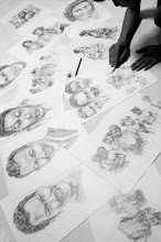
In this project, i decided to play with the shuffle method for my design concept, which means to cut and re-arrange the original picture i use until i got all the alphabet A to Z, however, i been through few steps to get my final outcome, which is using the grid system, edit and take out some unnecessary part and so on. My concept font is called "Jabbawockeez" since i use the picture of it (photo of my own performance which taken during University's Masquerade Party). Jabbawockeez is originally a hip-hop dance crew which attended and performed in America's Got Talent, all of the dancers are masked, they looks mysterious in a way. Whatever it is, that's the concept that i am trying to blend in for my concept font, it portray energetic, naughty, and mysterious, beside that it also symbolized a Jabbawockeez dancer.
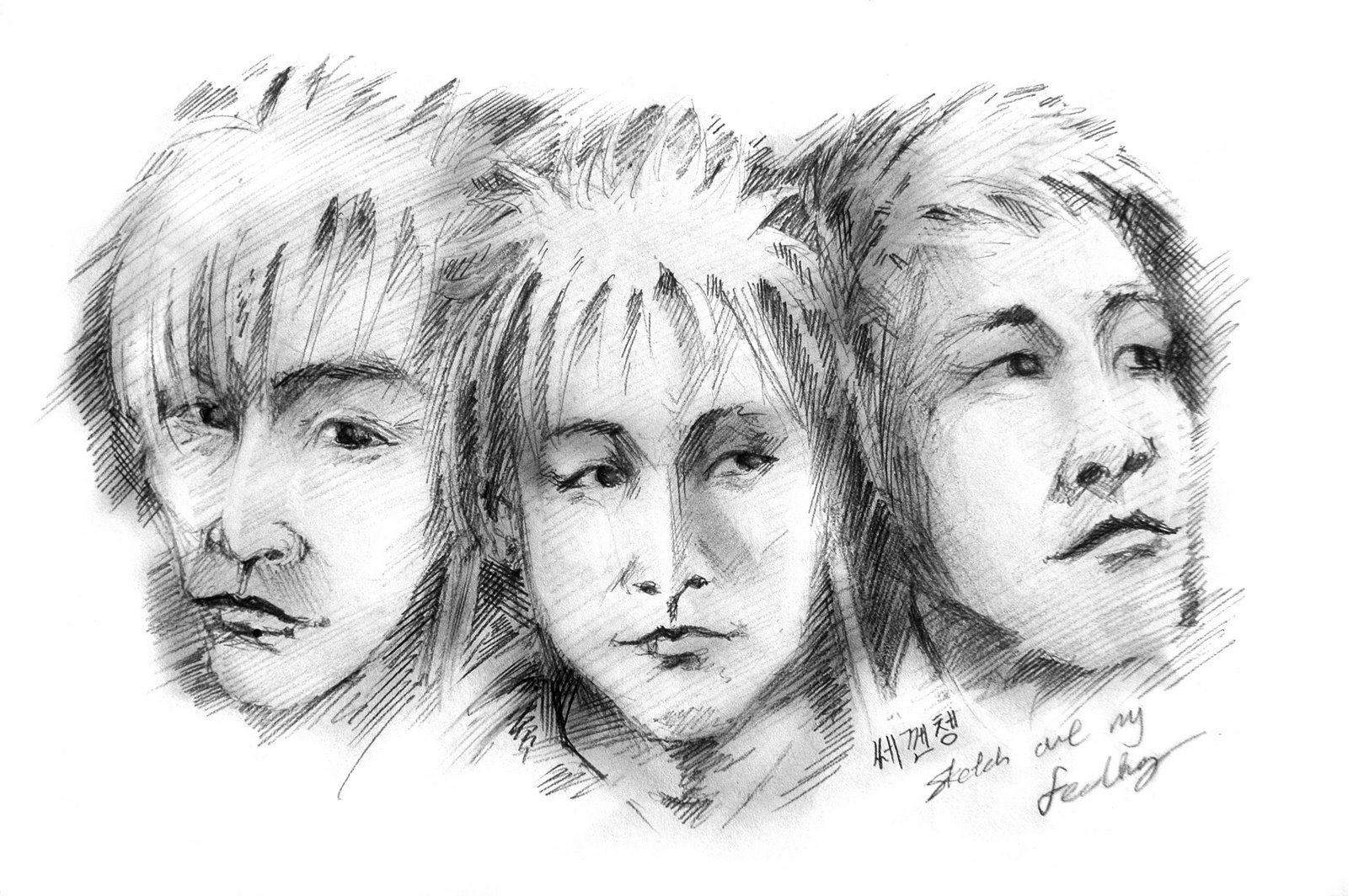
Here's the final outcome of the Uppercase and Lowercase, together with the headline that i create based on the original headline i found from the net, just try to use my concept font to play and to create the headline to see whether it practical to read... Well, it is readable...
Uppercase Lowercase
In this project, i decided to play with the shuffle method for my design concept, which means to cut and re-arrange the original picture i use until i got all the alphabet A to Z, however, i been through few steps to get my final outcome, which is using the grid system, edit and take out some unnecessary part and so on. My concept font is called "Jabbawockeez" since i use the picture of it (photo of my own performance which taken during University's Masquerade Party). Jabbawockeez is originally a hip-hop dance crew which attended and performed in America's Got Talent, all of the dancers are masked, they looks mysterious in a way. Whatever it is, that's the concept that i am trying to blend in for my concept font, it portray energetic, naughty, and mysterious, beside that it also symbolized a Jabbawockeez dancer.
Here's the final outcome of the Uppercase and Lowercase, together with the headline that i create based on the original headline i found from the net, just try to use my concept font to play and to create the headline to see whether it practical to read... Well, it is readable...
Uppercase
 Lowercase
Sample of headline (beware of JABBAWOCKEEZ)
That's all i want to share for now, was kinda pressure during the class critic session, but anyway, i am happy with the feedback i got from lecturer and classmates. Dear viewer, thanks for viewing and DO correct me if i am wrong. =)